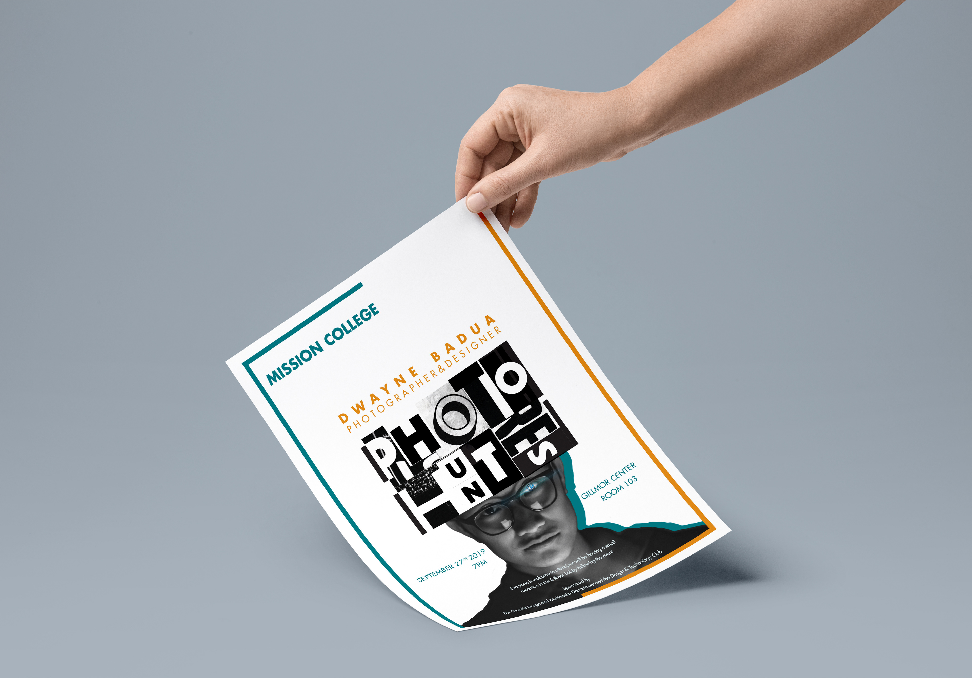
Creating a flyer is a task that each designer has to experience throughout their career. Designers must consider what should be on the flyer to make it effectively send the message to the audience. Similarly, the details on a flyer have to contribute and complement each other logically, so that is the designers’ ability to utilize those materials.
I created an event flyer for Mission College called Photo Hunters. The event was about a photography contest for students who are not only in Graphic Design faculty but also other departments who have a passion for photography and want to learn more about the cameras and photographic skills. I had to include a speaker who would be present as a professional photographer to talk about the purpose of this event and share the stories of photography. I inserted an artboard, which was the item that I was required to add in the flyer to compose a significant graphics for the brochure. This event took place in Mission College that I had to use their style as typeface, color palette to bring the visual observation of this college.
Flyer mock-up
Responsibilities
I collected the ideas, generated the elements, and merge them. Also, I was responsible for following the Mission College style guide to showcase the impression of this school. I would send the drafts and revise the flyer to improve it.
Research
In this case study, I observed the examples of flyers to acknowledge what item should be involved in the whole design. Collecting the inspirations would help to have a comprehensive observation of the project. On the other hand, the speaker who was going to be on the flyer should be an experienced photographer. I also had a glance at other Mission College flyers to know the style and how effective it works to connect to students.
Challenges
Initially, creating a flyer is challenging since it has a solid visual presentation to communicate to the audience. So, designers have to use typographic terms such as unity, hierarchy, proximity, alignment, continuity, and repetition. Second, the items on the flyer were limited, and I had to make correct decisions and gave each of them enough space. Third, I had to utilize the presentation board, so I had a restricted option to contribute it in the flyer. Fourth, choosing a photographer for the flyer was a requirement for this flyer, so I needed to reach out to have at least one of their images. Eventually, how to incorporate all of the elements that I wanted to express my ideas by sketching the thumbnails.
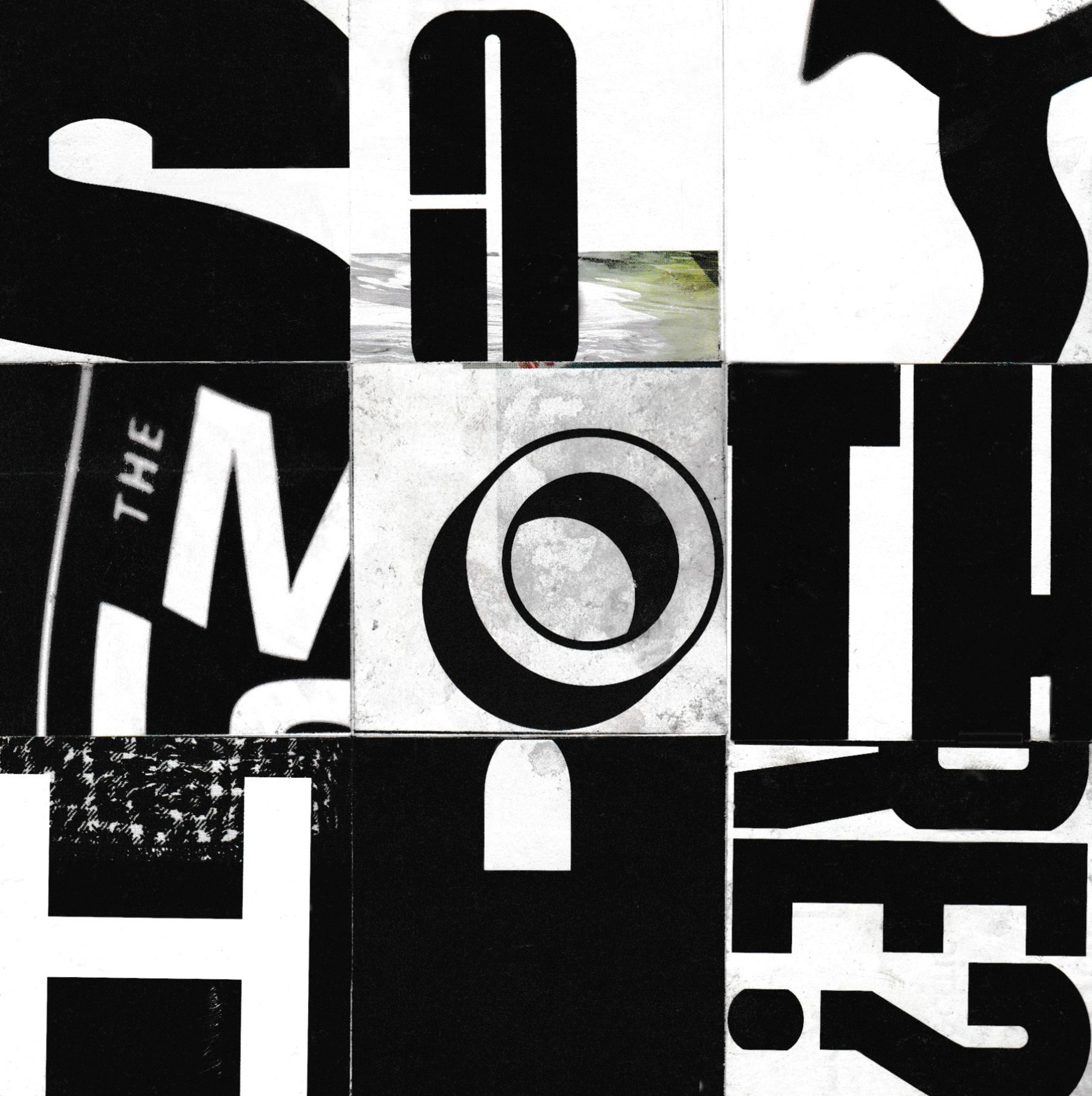
Cardboard

The speaker

The lens
Idea Expression
Sketching is the primary step for a designer to establish the ideas. Precisely, I would place the artboard at full opacity to take full advantage of it. Next, I would manipulate the artboard to make the title of the event.
The speaker would place at the third grid or in the middle of the flyer under the title surrounded by the information. I considered using two colors from Mission College style guide to keep the consistency for the layout.
Thumbnail sketches
Inspirational board
Problems
Through the design process, the layout was presented with a balanced hierarchy, but the alignment of the information needed adjustments. The artboard was an obstacle because it had to be displayed to contribute to the whole layout. Each item had to have enough negative space but being unified with each other. Also, I had to make an exciting presentation for the speaker that represented him as a professional photographer.
“
You can have an art experience in front of a Rembrandt… or in front of a piece of graphic design.
”
-Stefan Sagmeister-
You can have an art experience in front of a Rembrandt… or in front of a piece of graphic design.
”
-Stefan Sagmeister-
Solutions
Going through several solutions, I finalized the flyer with the primary Mission College Logo on the top of the flyer for the audience to know where it was held. The artboard was placed above the speaker at his head displayed as the event title. I manipulated the letters to get the name “Photo Hunters” that repeated the black and white blocks. I chose the speaker named Dwayne Badua since he has been a student but working as a professional photographer. Besides, to present him as a photographer, I put his name and his identity above the title and put a camera lens inside his eye. I took advantage of the black space to display the messages. Eventually, I used two colors from the style guide to putting the borderline around the flyer to bring the focus into the layout.
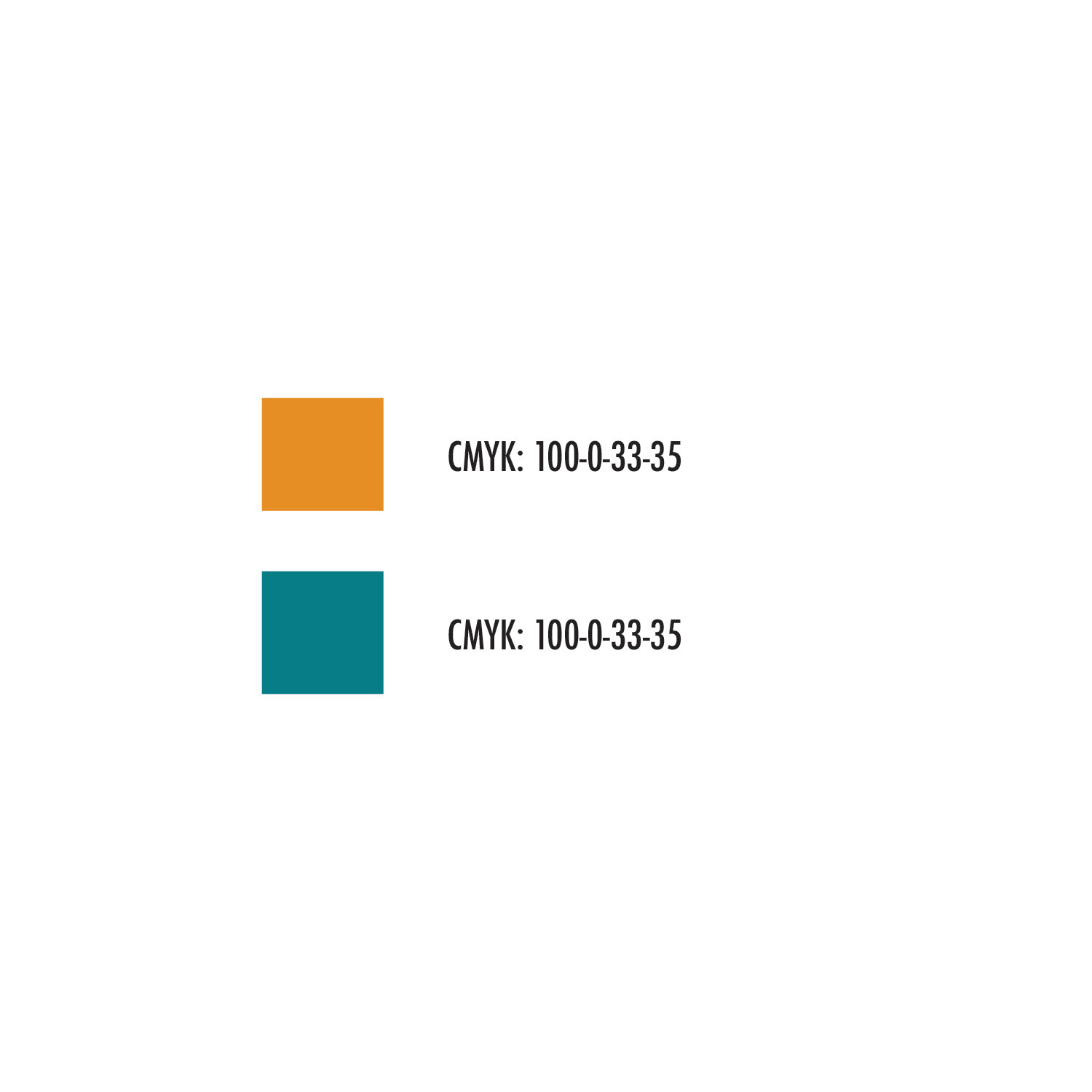
Mission College Primary Colors
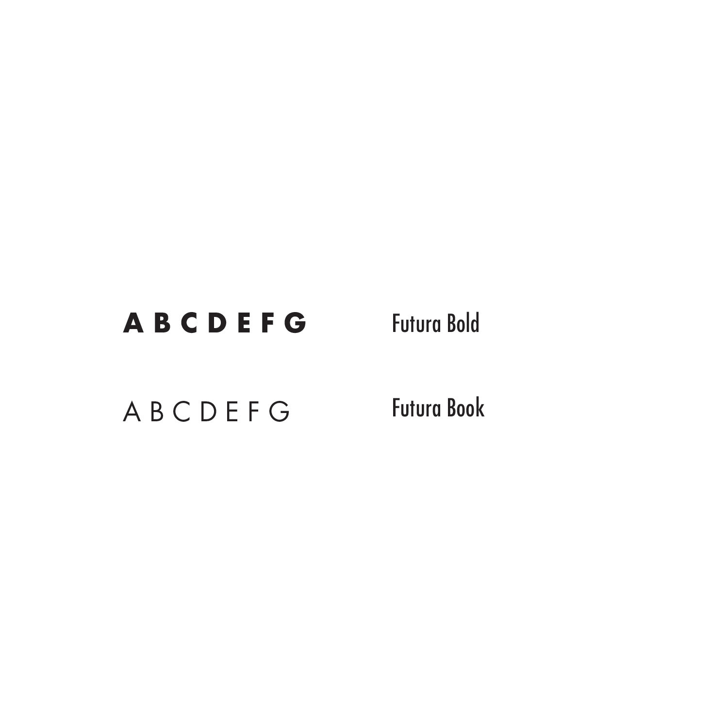
Mission College Primary Font
Deliverable
The complete design would be in letter size (8.5x11) and printed in CMYK color mode. I also delivered the design a digital to public it online.
Reflection
I believed the layout would present my designing style, and how I used the required materials to design a creative flyer. The space between each element was enough to bring attention. The alignment between the information was located balanced the entire presentation. Based on the photographic terms, I highly believe the flyer would be successful in communicating with the audience.
Conclusion
As a designer, I learned more about Graphic Design through every project that I have completed. From the flyer, I learned how to utilize the handcrafted item, and apply typographic terms into the design. In the future, I will use my creativity to design more flyers and other projects to gain experience and to train my skills.

Final deliverable
