13 reasons why TV show poster
MOVIE POSTER DESIGN
04/18/2019
04/18/2019
Objective
Designing movie posters is an exciting area that I want to work on in the future, so I challenged myself to make a movie poster for a TV show “13 Reasons Why.” A poster for the TV show was a task that I need to consider all the elements from the series to catch the attention of the audience. Plus, using design elements to make a successful poster for the show. The final design would be based on the research about the series, such as the story, the main characters, and the message from the movie to the audience.
I expressed my ideas from sketching out the layout for the poster while looking at the inspirational designs from other designers as well as the original posters. Eventually, using Illustrator to demonstrate the design with the considered elements and colors, then finalized it with texts.
13 Reasons Why poster mockup
“
Content precedes design. Design in the absence of content
is not design, it’s decoration.
Content precedes design. Design in the absence of content
is not design, it’s decoration.
”
-Zeffrey Zeldman-
Responsibilities
I assumed the tasks:
• Collecting the ideas to form a mood board
• Referencing the original poster
• Sketching out the concept
• Illustrating the visual element from the sketches
• Adding colors, contents, and typefaces
• Making mock-ups
• Collecting the ideas to form a mood board
• Referencing the original poster
• Sketching out the concept
• Illustrating the visual element from the sketches
• Adding colors, contents, and typefaces
• Making mock-ups
Research
The show told a suicidal story about a teenage high school girl named Hannah Baker, who had a normal life like others with her friends and family. Before she died, she recorded 13 tapes which demonstrated the reasons that led her to commit suicide. Thus, the ideas for the poster would have the tapes as the primary element. A dark theme covered the story that I needed to consider the tone of color for the poster include dark red and blue. Also, choosing an appropriate typeface for the poster was also crucial that correlate to the show.
Challenges
I had to include the primary elements such as the tapes, two main characters, the suicide scene, and other characters that also play essential roles during the show. Then, I was questioning that if I illustrate the aspects based on the original casts or draw it differently. Also, how to make the poster represent a crime scene which was the central theme of the series.
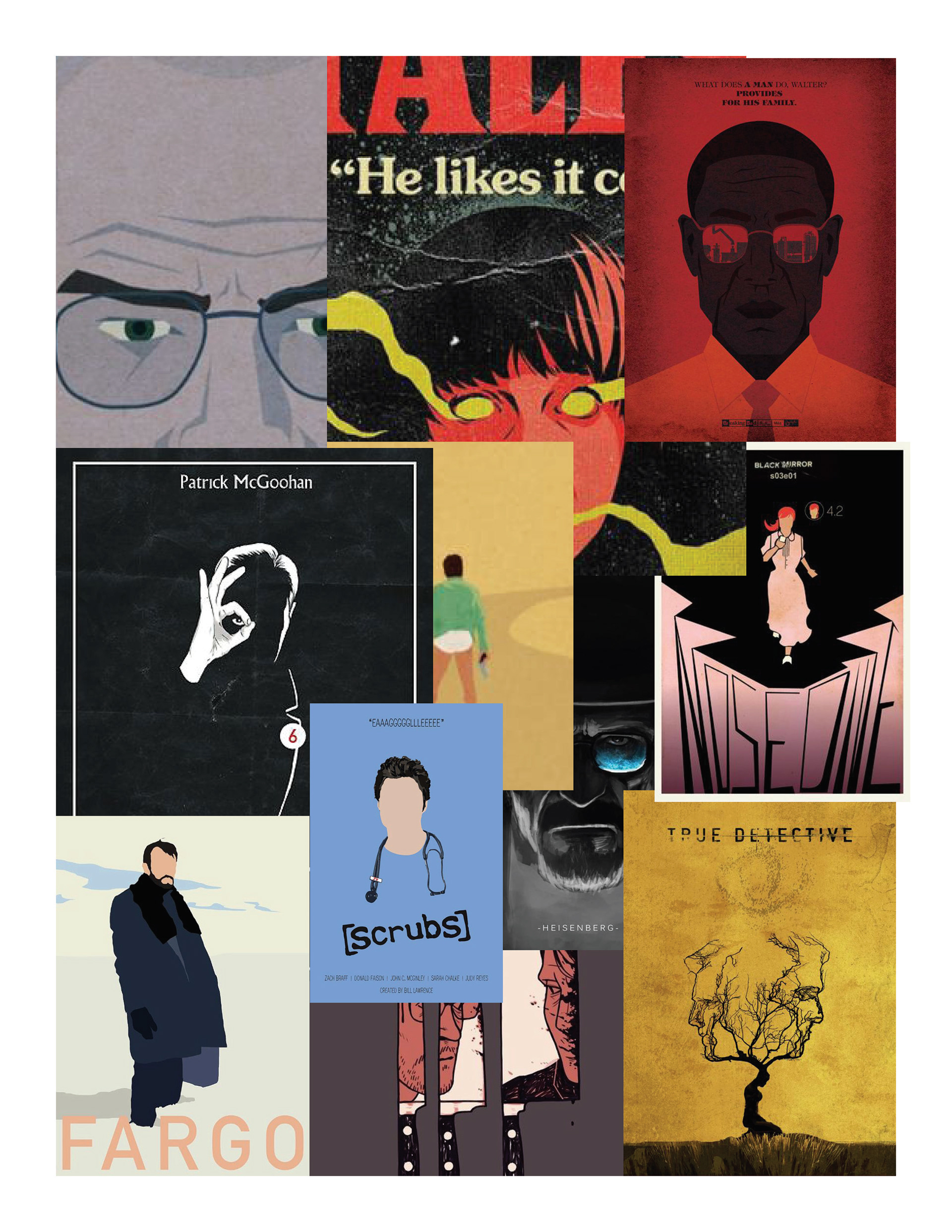
Moodboard
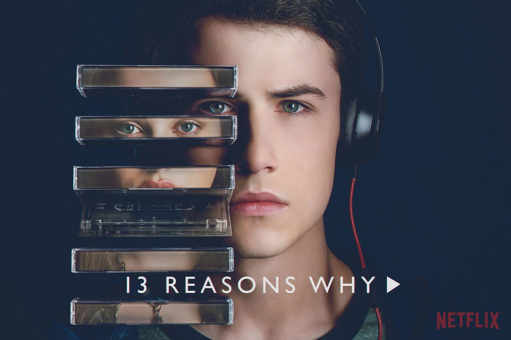
Original poster
Idea Expression
After collecting ideas for the mood board and reading the story, sketching out the ideas and layouts were the best way to express creativity. The following three sketches which had successful concepts include the major elements as the tapes, the main characters, and the crime scene.
3 sketches that I used to make the poster
"
Digital design is like painting, except the paint never dries.
"
-Neville Brody-
"
-Neville Brody-
The alignment of all items would be considered by typographical skills, appropriate hierarchy plus suitable typeface for each text element. The primary color scheme would be dark tone colors such as dark blue, red, and shadow shades.
Problems
It was challenging because I needed to think how the characters would be demonstrated, where the tapes were going to be, and Then, I spent the time to look for appropriates typefaces to fit in
the poster.
the poster.
The drafts had many typographical errors, lacked highlight and shadow tones, which made the poster less attractive. I should include more details to the hair and the background to enhance the visual display. The locations of the texts needed to improve for better hierarchy and the alignment between the visual elements.
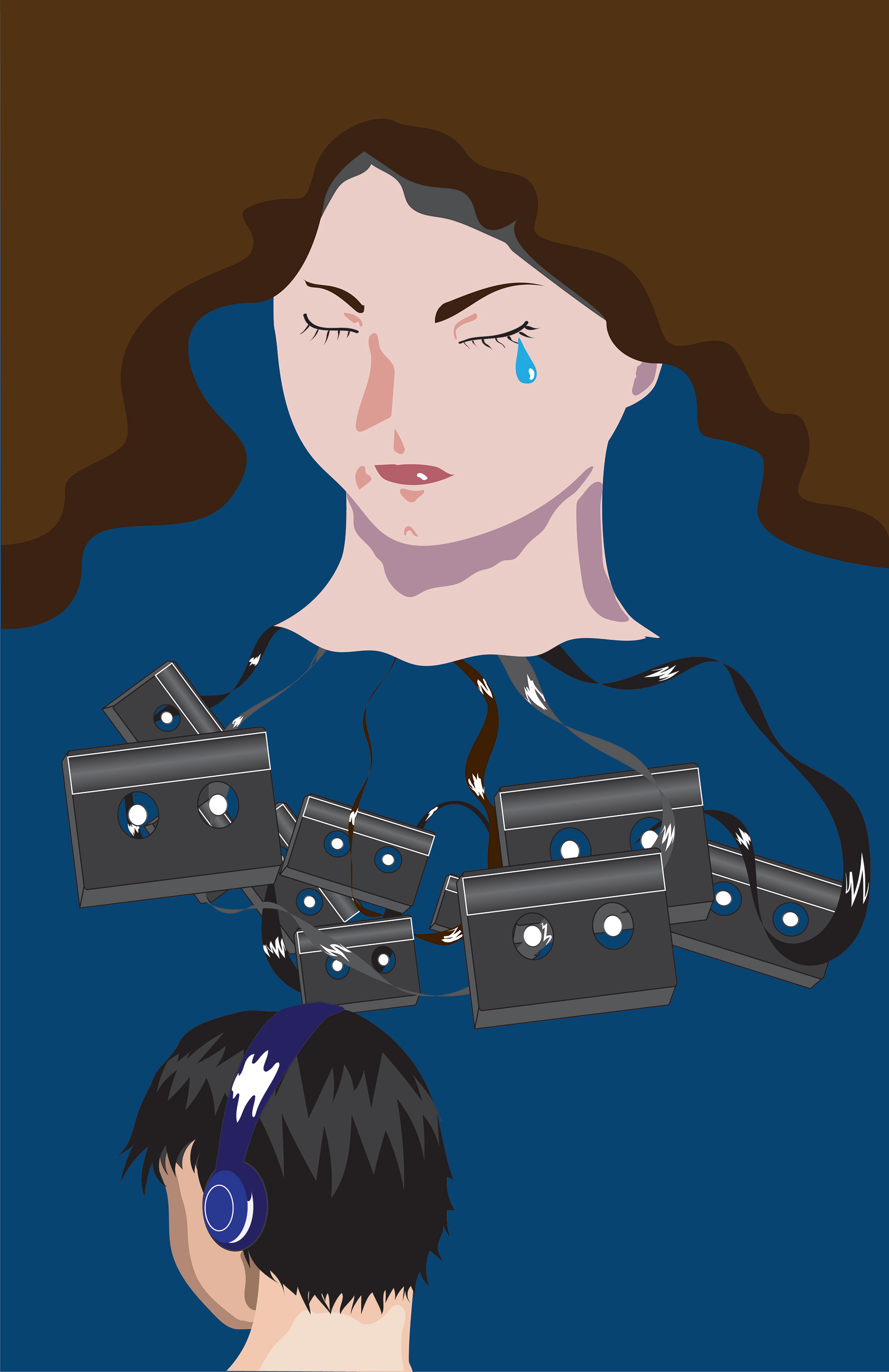
1st draft
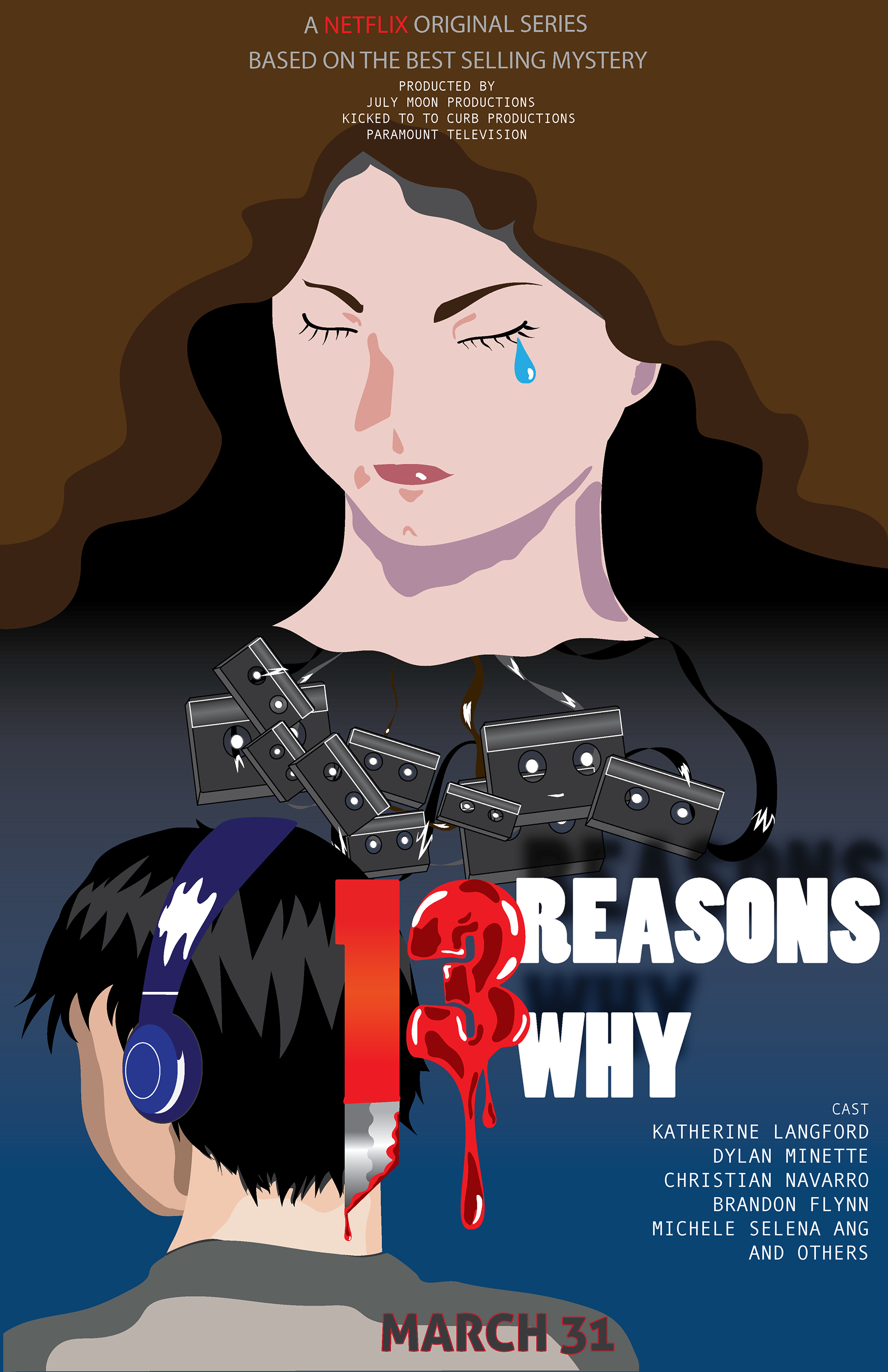
Solutions
I reconsidered the alignment between major elements to unify the entire poster. I used bold Tenso font to demonstrate the series’ name, Myriad Pro as Netflix’s tagline and information, and Andale Mono as cast’s names. To finalized the poster, I tried many versions with several ways of arrangement to obtain the best solution. Besides, I took my time to observe other movie posters to acknowledge how their designers came up with the elements and how they put them together. Eventually, the primary colors would be red, blue, brown, and black in dark tone to express the atmosphere throughout the story.
Deliverable
The deliverable design would be done in Illustrator both printed and digital in tabloid size. First, to illustrate the female character, I chose the first sketch to demonstrate her as the central role for the entire series. Next, the male character was from my second sketch; he is wearing the headphone as he is listening to the tapes, which were the essential element of the show. Then, I manipulated the number “13” into a bloody shape as the third sketch become a knife and blood bleeding from figure “3,” implying the crime story about suicide. Finally, I added the Netflix tagline in minor size on top followed by the producer information, and the casts.
Reflection
I believed the overall design efficiently works for the TV show, which demonstrated the whole story. There were areas that I could make improvements such as the hair, the shades of skin tone, and the background. Through this project, I also improved my illustration skills, manage the principal elements, and how to unify them.
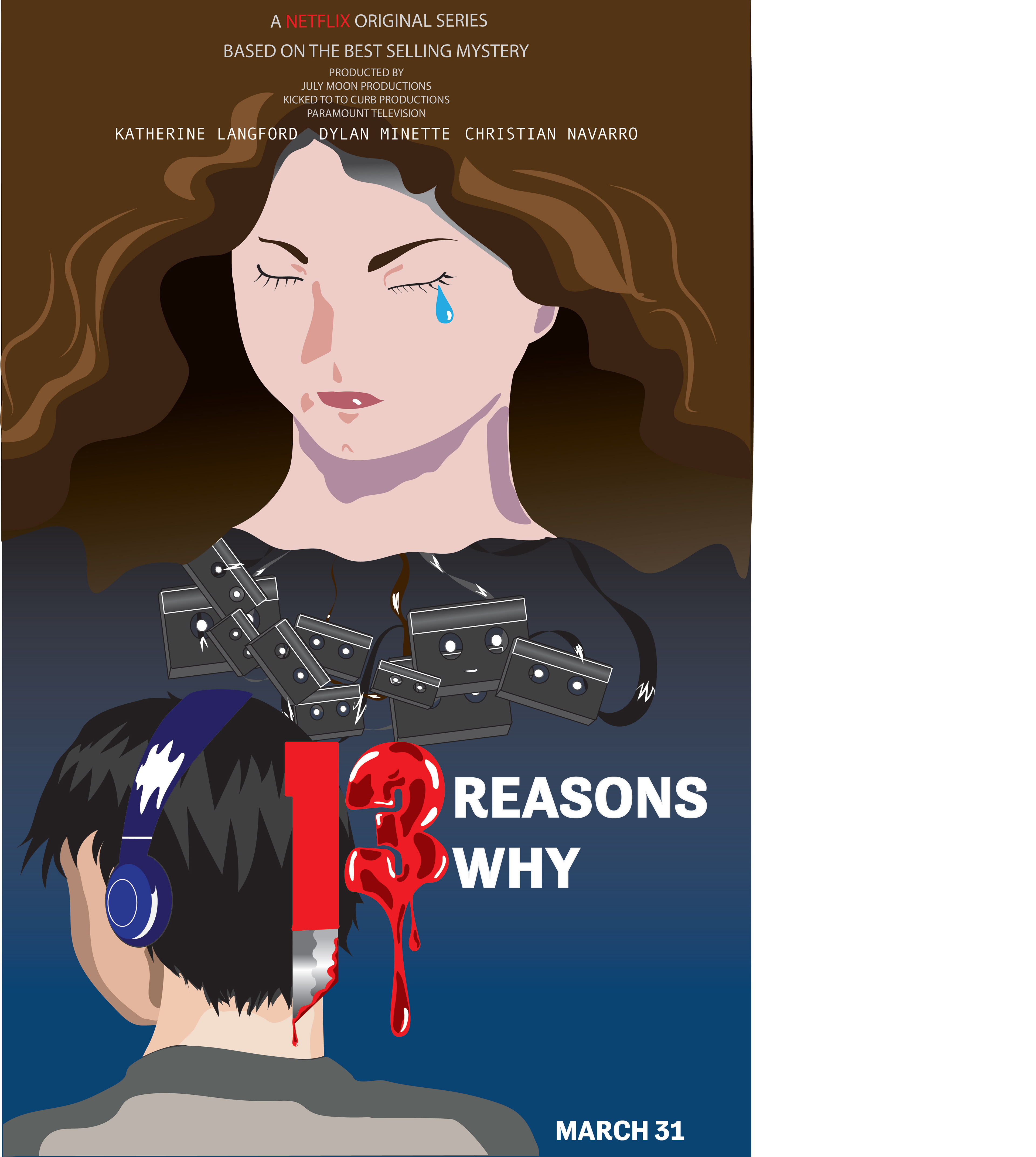
Final deliverabe
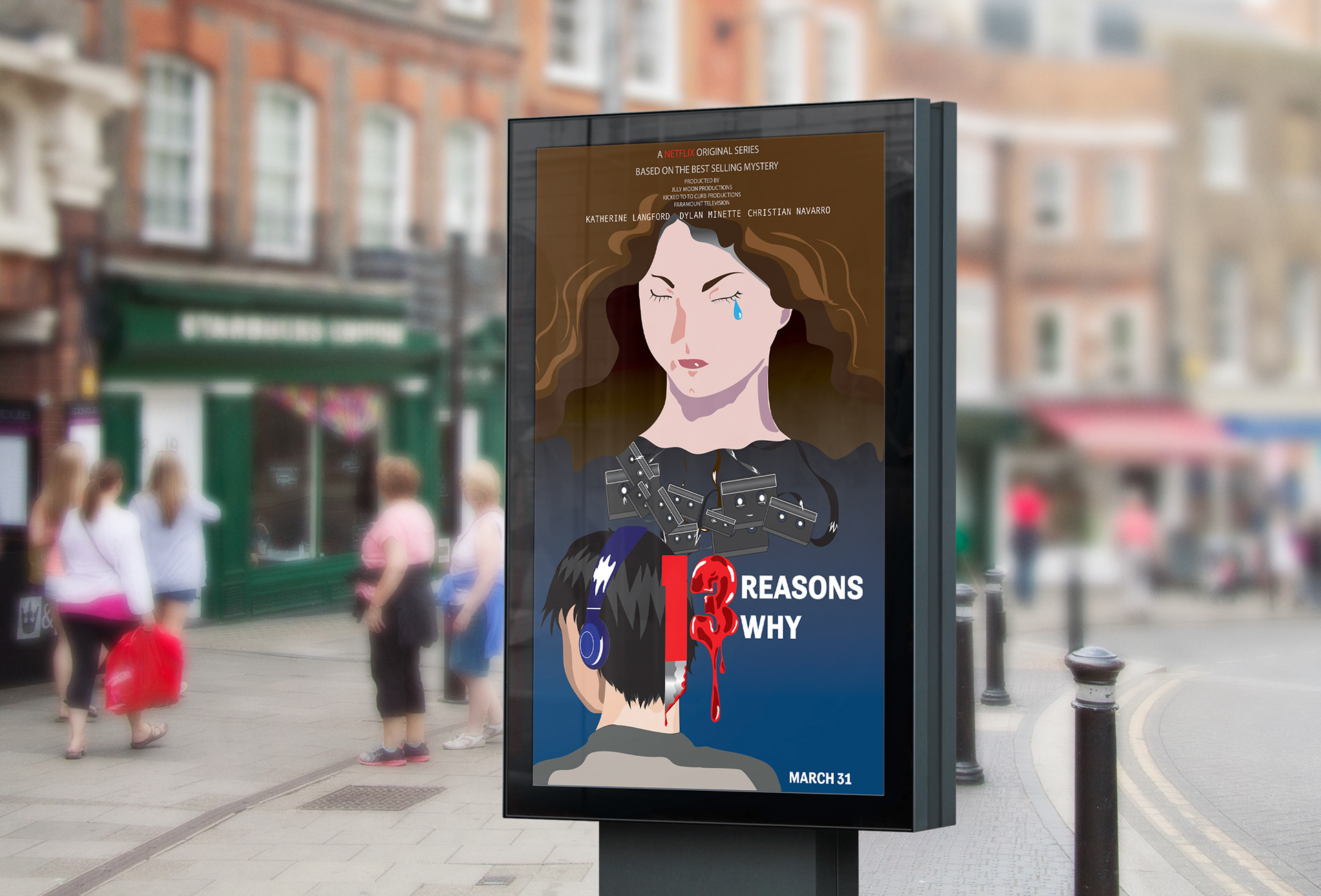
Final deliverable mockup
Conclusion
Designing movie posters is one of my goals in graphic design. In the future, I will challenge myself by making more posters not only in Illustrator but also using imagery to create the original posters. I want to present this project in my portfolio to show my passion and keep improving my skills every day.