Objective
Fandango is an app for smartphone users who love movies and frequently come to movie theaters. Fandango does its functions with a friendly user interface, quick responses but remains a few uncomfortable features. To improved the app, I challenged myself to design a new interface for the app as well as reduce the irrelevant functions and features.
I noticed some of its features are in the inappropriate hierarchy, which causes confusions for users. At this point, I would design new interfaces that represent the fast task flows, true icons, better color scheme, and more convenient functions for universal users and movie fans.
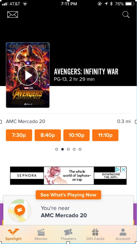
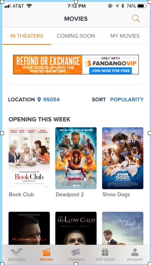
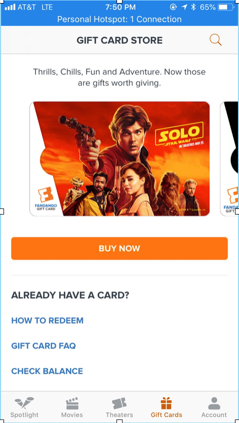
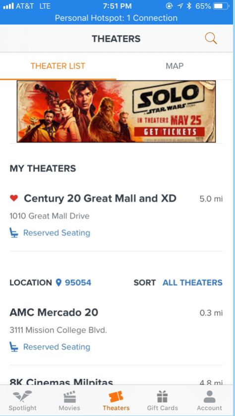
The app works well in both user interface and experience, but the hierarchy causes confusion for users
Responsibilities
As a designer, I assumed the position as an interface creator and built a prototype for the app. Specifically, I was responsible for designing a wireframe for this app after brainstorming and researching the users’ expectations. I would perform the task flow in Adobe XD to show the overall functions and features.
Research
Fandango is a ticketing company that sells movie tickets through its website and mobile app. It was founded by Regal Cinema based in Los Angeles, California, and Paul Yanover has been the CEO since 2012. Fandango is a useful app for movie fans that includes movie information, showtimes, ticket preorder, navigation with accurate results. Besides, they also provide users a membership option for those who want to obtain benefits such as rewards or refunds and exchanges. Fandango is a free app, so many commercial ads may distract users from their experience while using the app, so I would relocate the ads to give a better visuality.
Challenges
To improve the app, it was not a one-day job which can replace the previous design thoroughly. I must have specific strategies for each screen such as the proximity of elements, hierarchy of each part, the task flow between the windows, the unity, and other tasks.
Moreover, I also acknowledged that it was an obstacle when users have to adapt to the new interface. Some people would think it is not going to work well compared to the old version, which already has a practical design.
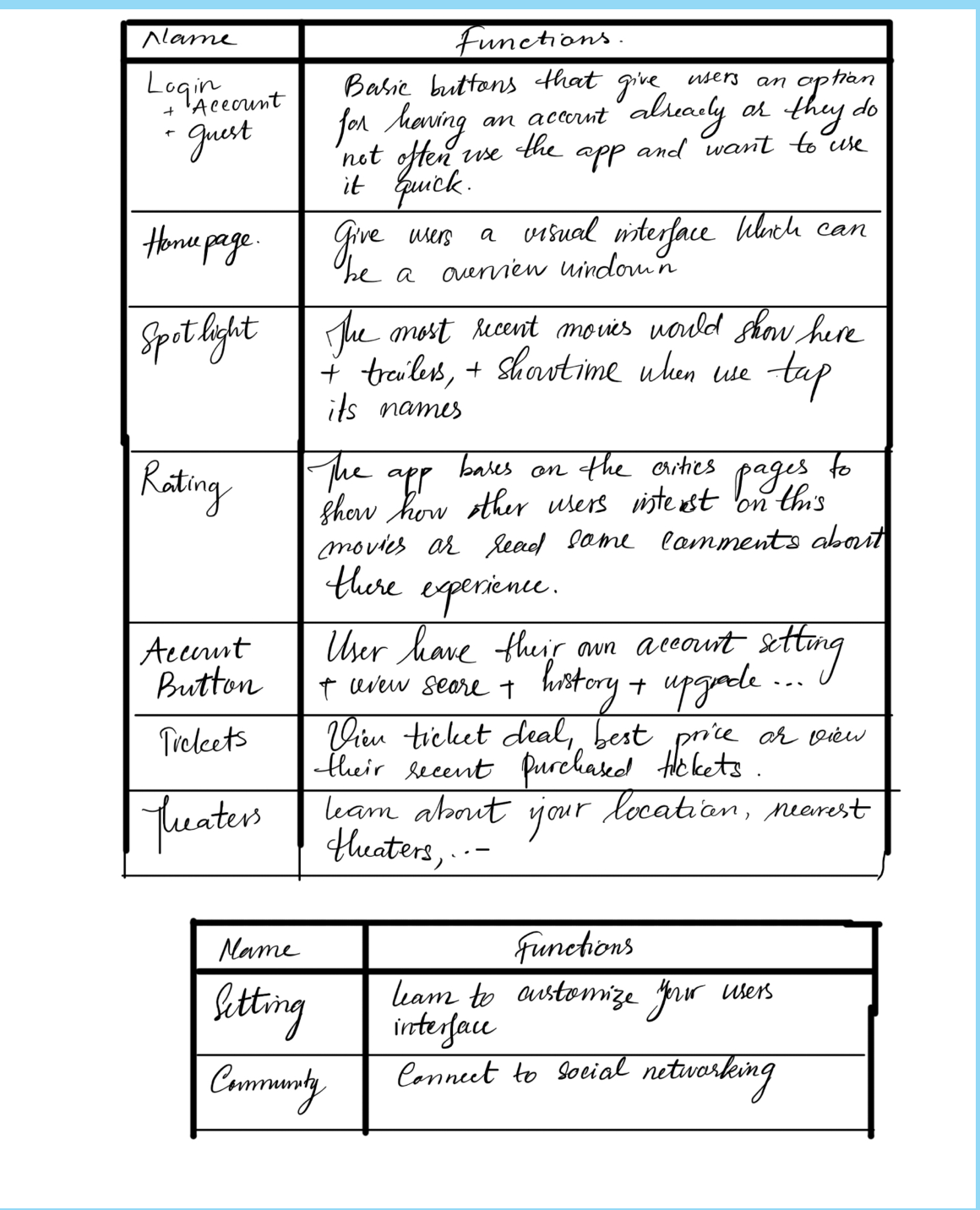
Function suggestions have to be included within the app
“
It’s through mistakes that you actually can grow.
You have to get bad in order to get good.
”
It’s through mistakes that you actually can grow.
You have to get bad in order to get good.
”
-Paula Scher-
Idea Expression
I used a post-it note to express the ideas during the design process. Brainstorming the features in which I had to present, connect, and rearrange them after showcasing the senses toward the design.
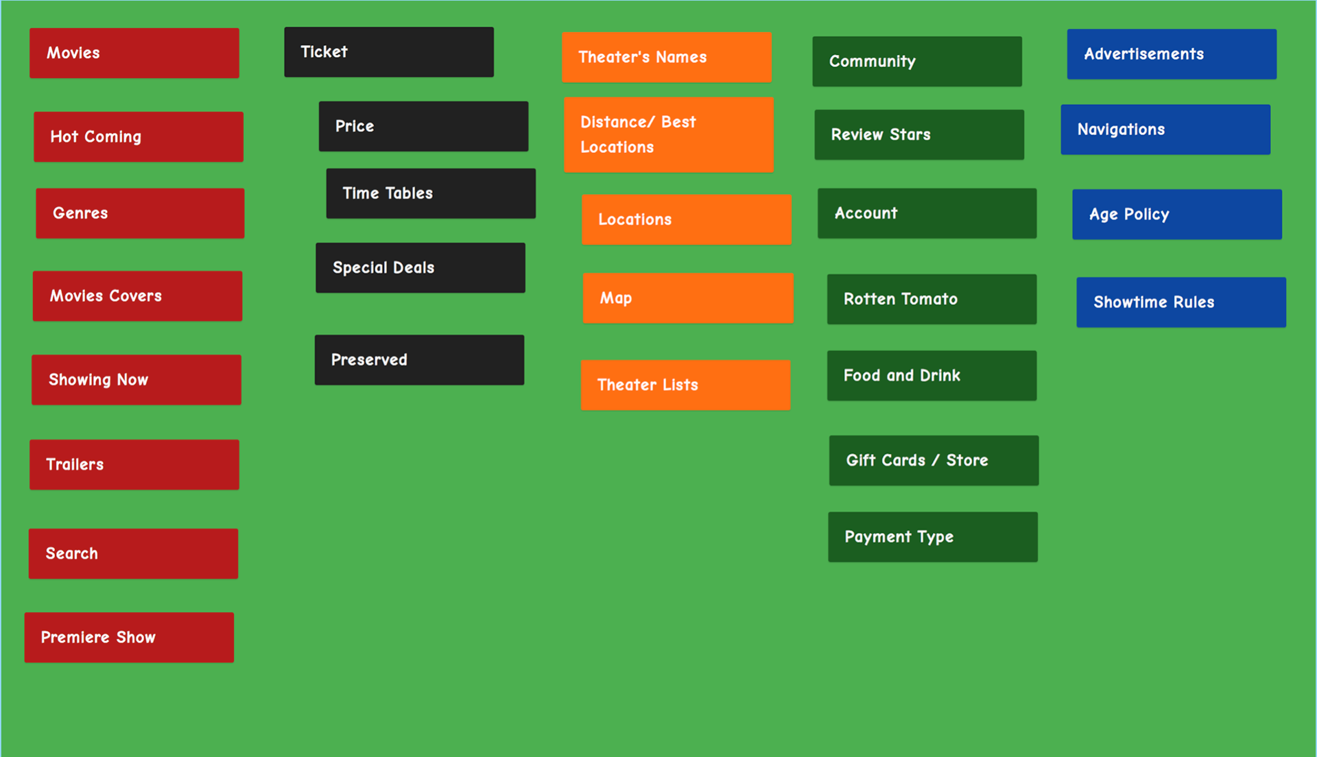
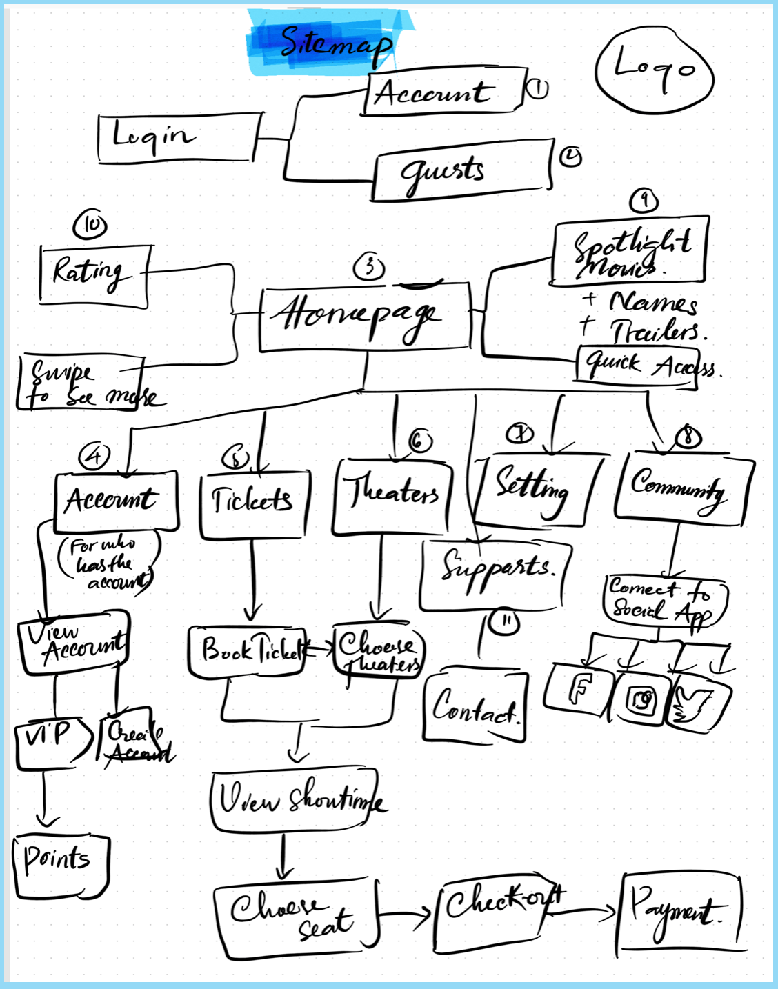
Post-it notes and Sitemap
"
The public is more familiar with bad design than good design. It is, in effect, conditioned to prefer bad design, because that is what it lives with. The new becomes threatening, the old reassuring.
"
The public is more familiar with bad design than good design. It is, in effect, conditioned to prefer bad design, because that is what it lives with. The new becomes threatening, the old reassuring.
"
-Paul Rand-
Wireframe associated with the design
To build a mobile app, I must have a sitemap to demonstrate the internal features as well as the task flow. A site map helped to unify and modify the functions in an appropriate way and fill out the blanks within the design. Based on the sitemap, wireframes should be present to have a general observation before getting to do the prototype and design
the interface.
the interface.
Problems
I found some improvements to help users quickly navigate new movies, book tickets, see the reviews, and view their membership status. The app connected with only one movie critique page and the ads distract users throughout
their experience.
their experience.
Plus, I thought of changing the entire app’s colors, which are black, orange, and white into blue and its shades. However, it did not work out as an ideal user interface since blue has less contrast and hard for the user to track the features.
Solutions
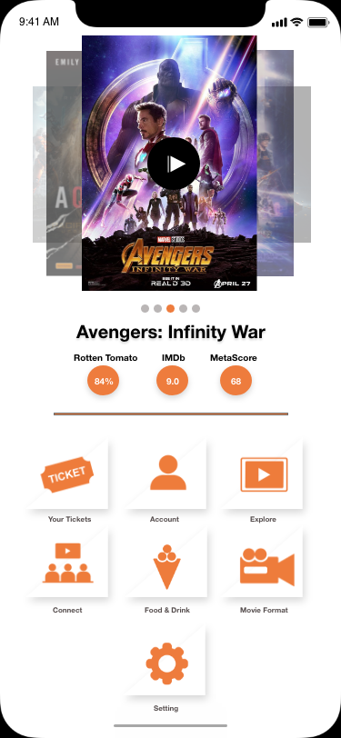
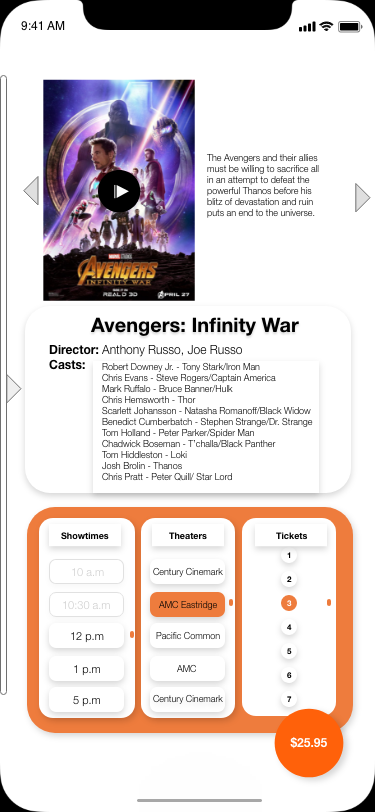
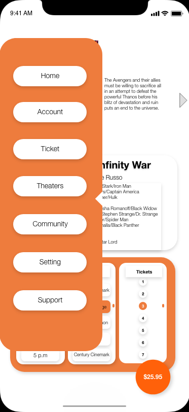
Initially, I would like to adjust the alignment and proximity of the features as well as provide the ads with an appropriate place not to affect users experience. To improve the accuracy of the movie, such as showtimes, ticket prices, and reviews, I would connect to more critique sites includes Metascore, IMDB, and Rotten Tomato. I would change the location of the functions such as separate or unify them into effective ways for users when they experience the app.
The color scheme has a high contrast with orange and white works effectively for users to navigate the functions and changing the font to Helvetica Neue to gives the application a modern look.
The color palette associates with the original app
Deliverable
The app has been developed in Adobe XD. The designs come along with the prototype. Hence, I could give the client the visual interface and the connections between each screen. My coworkers and friends would initially experience the beta test. From their feedback, I will make revisions and sent the drafts until it works effectively.
Reflection
Redesigning Fandango app was a challenging project which I had dedicated much time to brainstorm and sketch out the idea from the base. The overall redesign contained the features of the old version matched with the modern presentation. I believe there are many rooms for improvements that I highly expect the feedback from users to enhance the design.
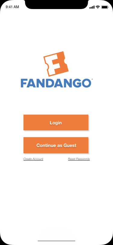
Final deliverables
Conclusion
I love movies, and I wanted to improve the app for a better presentation and experience. I redesigned the interface while keeping the colors and its main features. Moreover, the design process followed the tasks from brainstorming, discussing, sketching, and building information to the high-resolution product. Then, I would continue to develop the user interface for this application and also challenge myself to other mobile apps.
